
My company owns a bunch of subway apps, but one of our most popular ones is SUBWAY:NYC. Obviously, this app in particular has seen dramatic decreases in usage as a result of the worldwide pandemic that’s hit NYC especially hard. While that’s bad for me, I thought it might be interesting to look at the differences between last year and this year, and see what kind of effects various governmental communications and orders have had.
Without further ado, let’s look at some data!
Here’s a graph of the number of times per day my app was opened, starting on the 27th day of the year through the 88th (conveniently, this year that’s Jan 27 through Mar 28th):
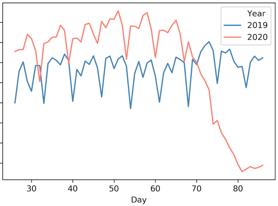
As you can see, from the beginning of the graph to around day 50 (around Feb 19th), the app saw a slow increase of usage – this is not unusual, as people tend to start traveling more after January. The last third of February through the first third of March shows some modest decline in usage. Then there’s a pretty dramatic drop off starting on March 8th/9th (just before day 70, which is Mar 10th), and continuing after the 15th.
What could have caused these things? Well, towards the end of February, people were starting to get nervous about community spread in the US; Washington state in particular was known to have been hit hard, and there were worries that testing was insufficient to say where else it was.
March 1st NYC had its first case of coronavirus. Personally, I know that’s when I started seriously curtailing my own subway riding, and it looks like some other people did too.
What happened March 8th? Mayor De Blasio announced that vulnerable populations should avoid public places, discouraged handshakes, and made comments about avoiding the subway. This was the first time a city official had warned people that they should do something other than go about their daily lives.
Over the next week, it looks like many people seriously decreased their subway ridership – and many stayed home from work, with Google, Twitter, Facebook, and Amazon among others instituting WFH policies that week.
There’s a slight uptick on around day 74, which I suspect is the weekend crowd going to bars.
On the 15th of March, New York City closed all schools. This caused an additional drop in app usership, as the school system is one of the largest employers in the city. This is also the day I personally decided it was time to evacuate the city.
For good measure, here’s another graph:
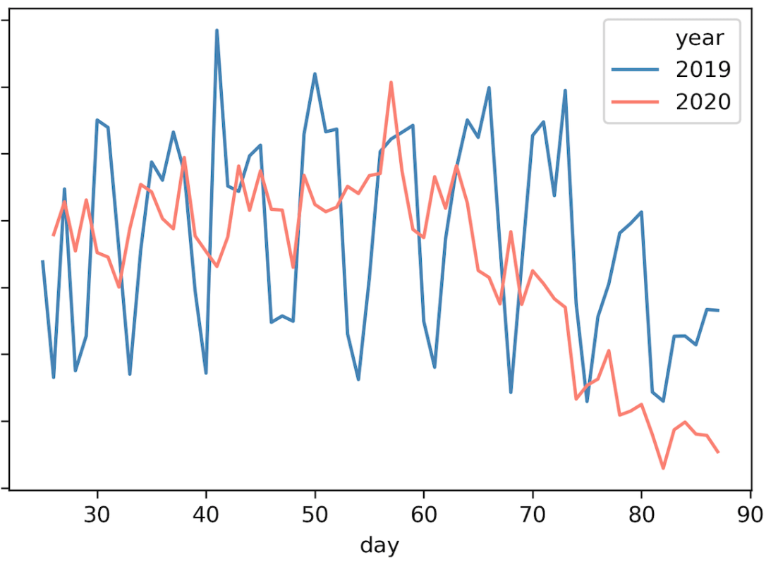
My app collects user reports of train arrivals, and this graph represents the number of those reports per day. The difference with this graph, then, is that instead of just counting the number of people who opened the app in a day, it counts how many stations were traveled by those people (or, at least, the people who chose to report that info). As you can see, adding this to the graph above, we see that the number of stations traveled even more clearly started to decline from the beginning of March onwards. With big drops after the first case of coronavirus and the schools closing.
Anyway, I hope these graphs helped you visualize how people have been quarantining themselves, and when people actually started to take things seriously – in New York at least.
