

Working on a lot of iOS apps means working with a lot of designers. One of the most common questions I get from those designers is “How do I make these designs easy for you to implement?” My answer is invariably: skin the existing iOS UI/UX elements rather than create your own. Unfortunately, that advice is not actually very helpful, especially for designers new to the platform. This post will go through some of these UI/UX elements, and the easy ways they can be styled.
Fonts
The built in fonts available to iOS developers can be found on Apple’s developer website. Using one of those fonts makes things very simple for iOS developers – however, it’s not a ton more work to add additional fonts in TTF or OTF format.
Navigation Bar
The navigation bar is one most common UI elements that designers want to change while simultaneously being one of the harder ones to mess with. First, though, let’s take a look at it what it is and what it does.
The navigation bar sits at the top of the screen and consists of a centered title and left/right justified sets of buttons. As the user moves from screen to screen, the navigation bar, by default, displays a back button on the left side.
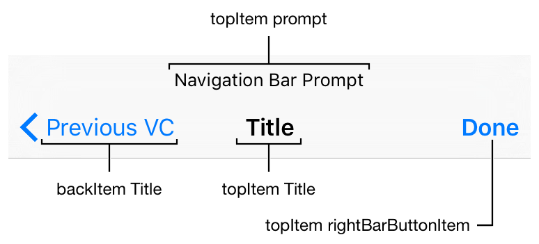
Relatively easy things to do with a navigation bar: change the title, button icons/text, the bar’s background color, text color, the color that it automatically tints button icons/text, toggle whether it is translucent, and fonts. That’s about it. To make the glaring absences explicit: changing its dimensions, location, or justifications are not easy, per se.
One last note: that centered title *can* be replaced by a custom view – however, the other limitations on size, location, and justification still apply, so that extra flexibility doesn’t buy you much leeway.
Tabs
I like to say that tab bars are like navigation bars, but on the bottom. However, that doesn’t do them justice: they’re also more restrictive.
In code, tab bars do a fair amount of heavy lifting for developers and Apple wants them to be pretty uniform across the platform; as a result, it can be difficult to make many cosmetic changes.
A tab bar sits at the bottom of the screen and displays a horizontal list of icons and/or titles.

Like the navigation bar, you can easily change the icons/text of each , the bar’s background color, text color, the color that it automatically tints button icons/text, toggle whether it is translucent, and fonts.
Text fields
The good news is that text fields are pretty flexible! You can change lots of things about them. However, there are only so many built in things you can do, especially with respect to its background.
Specifically, Apple provides the standard ’rounded rectangle’ by default:

You can also remove that as a background completely, and add a custom background subject to the same restrictions as a button (which is pretty flexible). However, unlike a button, text fields make it a little harder to manage the state of the button (selected, normal, disabled, etc). So, if a designer wants to use Material Design style text view underlining which changes color when it’s selected, developers have to put in a bit more work. Not a ton, but just something to be aware of.
Lists
In iOS there are two similar UI components that handle lists of things: table views and collection views.
Tables are a simple vertical list of items with one item per line; it was originally built to display a list of contacts like in the contacts app, so think of its abilities as limited to more or less something like that.
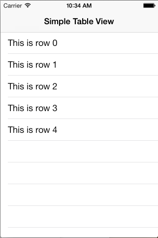
That said, you can get more complicated and tricky; just about every ‘feed,’ notifications screen, messages screen, search results screen, and the like are actually table views. Each ‘line’ can more or less be as complicated as you want, within certain limits described below.
Collection views can handle more complex arrangements of items, namely, more than one per line.
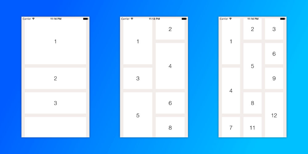
Think of this like the Pinterest mobile layout, where you have two columns of pins. Alternatively, many photos apps (probably) use collection views to display their contents. Accordingly for these more complex arrangements, they can be slightly more complicated to implement from a development standpoint.
The main difficulty with lists comes from variable sizes of cells and changing the size of a cell on the fly, usually in the course of an animation. Let me give an example to illustrate what I mean.
First, imagine something like a Facebook feed: a series of posts, by users, with comments on them. How many comments? An arbitrary number: maybe one, maybe none, maybe a thousand. Trying to make a cell that represents a post including all the comments is complicated because to do so we’d need to a) add a bunch of comments to the cell on the fly (poor performance), b) include in the cell spaces for an arbitrary number of comments (poor performance, hard to maintain), or c) break a post up into different pieces, one for the post itself and a bunch more for the comments (hard to build and maintain, increases costs).
The solution is usually to include a set number of comments on the feed screen with a button to see all comments, which takes you to a new screen with all the comments.
Similarly, when you’re trying to change the size of a cell, the table can glitch – this is because Apple intends for us to create static cells, while the table itself handles how they are arranged, sized, and the like. It is possible to make it work, but it’s buggy, fragile, and often not worth the time.
Labels
Labels contain text. Do whatever you want with labels, they’re incredibly flexible.
Buttons
Buttons are also really flexible. There’s some slight complexity when it comes to different states (eg pressed state vs unpressed) that designers should keep in mind, but otherwise I’ve never really seen something a designer wanted to do that wasn’t relatively easy to do. That said, the number of things to change can sometimes be large.
By default, buttons consist of what amounts to some text that changes transparency when pressed/disabled. You can add borders, you can add background images, change colors, change fonts… the world is your oyster, designers, go wild. But the further you get from some adjustable transparency text, the more time it will take (on the scale of hours, really, not days or more).
The only warnings I have are:
- Buttons don’t love to have their justification changed.
- Buttons by default allow an icon on the left side of the text, with a small margin between it and the text.
So, basically, it’s harder to move the text around within a button (eg left or right justified), and trying to put the icon at the far left while keeping the text centered would take more work than you probably want a dev to put in.
Dropdowns
They don’t exist in iOS, so putting them in your designs means we have to create them from scratch or use a library to do it. The easy (and Apple recommended) alternatives include taking the user to a list page, popping up an Action Sheet, or prompting them with a modal alert.
Animations
Anyone who’s worked with me knows I love some slick animations. The trick to keep animations easy to manage is to keep them within the same screen. It’s relatively easy to create animations within a screen, but making an animation start in one screen, pass through a transition, and continue in another screen is much more complicated.
Conclusion
That’s what I got for now. Have questions? Things I left out? Feel free to comment below! Or reach out and chat with me about it.
 schrock { block }